AIR CHEK RADON TEST KIT
Packaging - Walmart Sidekick PoP - Video - Print / Digital Ads - Photography

Air Chek Radon Test Kit Launch
This project began before I arrived at Spruce. It started as a consumer packaging project for the Air Chek Radon Test Kit. Upon being onboarded, I directed the freelance artist through the first production run.
While the design was clean, there were certain parts I wanted changed. “RADON” on the front of the packaging got lost with the background, the copy on the back was a bit hard to read and would run into issues during the print process. Also, I felt as though the front of the packaging needed to be simplified. Because the test was extremely easy to use, I wanted that noted on the front.
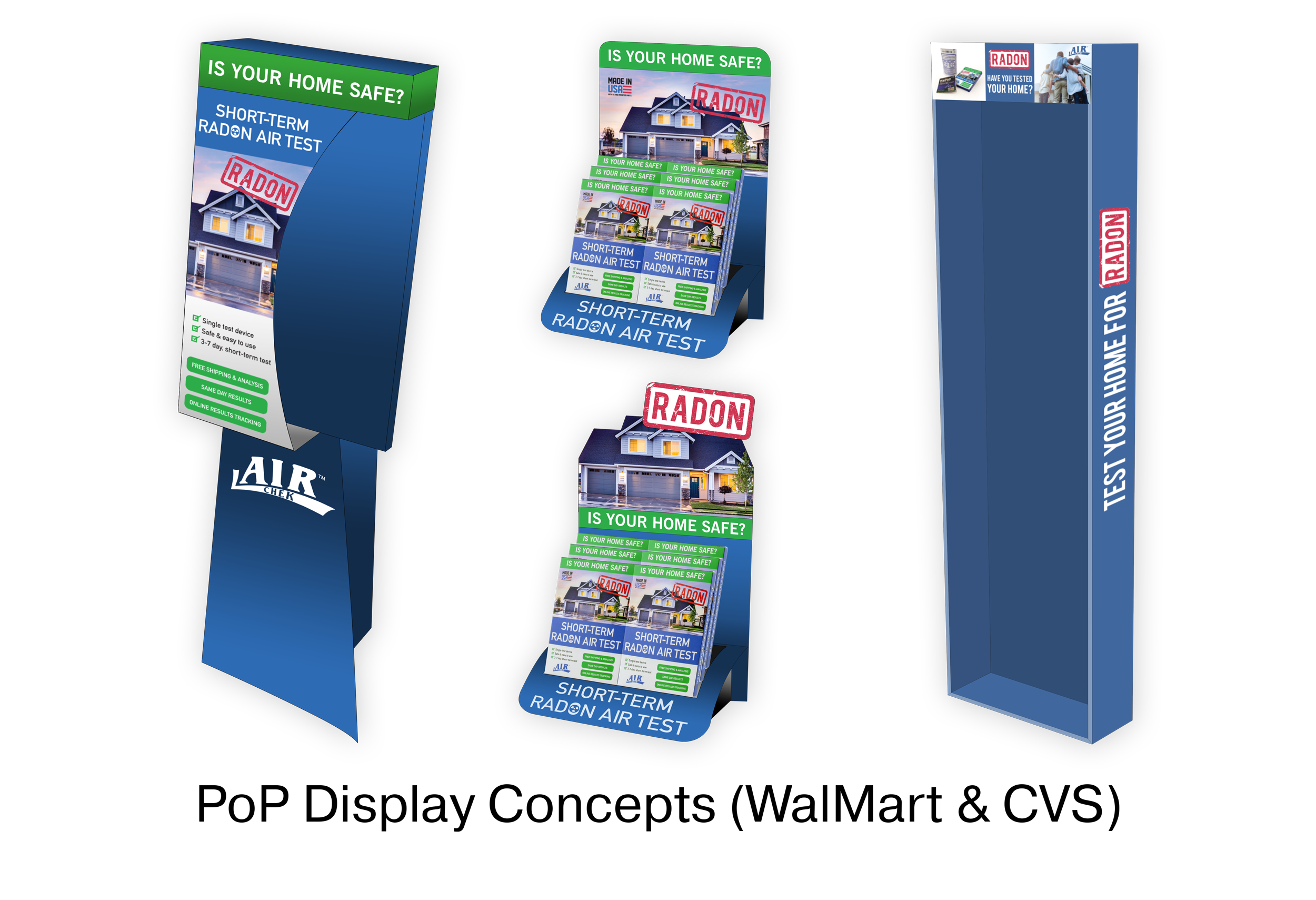
Right in the middle of the second production run and redesign, Air Chek struck up a deal with both CVS and Walmart. PoP and PoS concept design was added to the design list.
Beginning with the packaging, I was given a list of “must have” changes by the executive vice president.
1. Change the front tagline to “IS YOUR FAMILY SAFE? TEST YOUR HOME FOR RADON
2. More green
3. Call outs in red.
4. Add “ALL FEES INCLUDED”
This presented a few problems from a branding perspective as the green and red went directly against our style guide. Green was worked into the first design in the same manner. It does offset the blue and white nicely, but the plan was to use it sparingly. Blue is the main color used in the Air Chek branding.
The 2nd design followed with all the requested changes along with my changes. The back was made easier to read if the print went off, a simple set of instructions were added to the front, a white background was added to the “RADON STAMP” and the background image was changed out to a “happy” family.
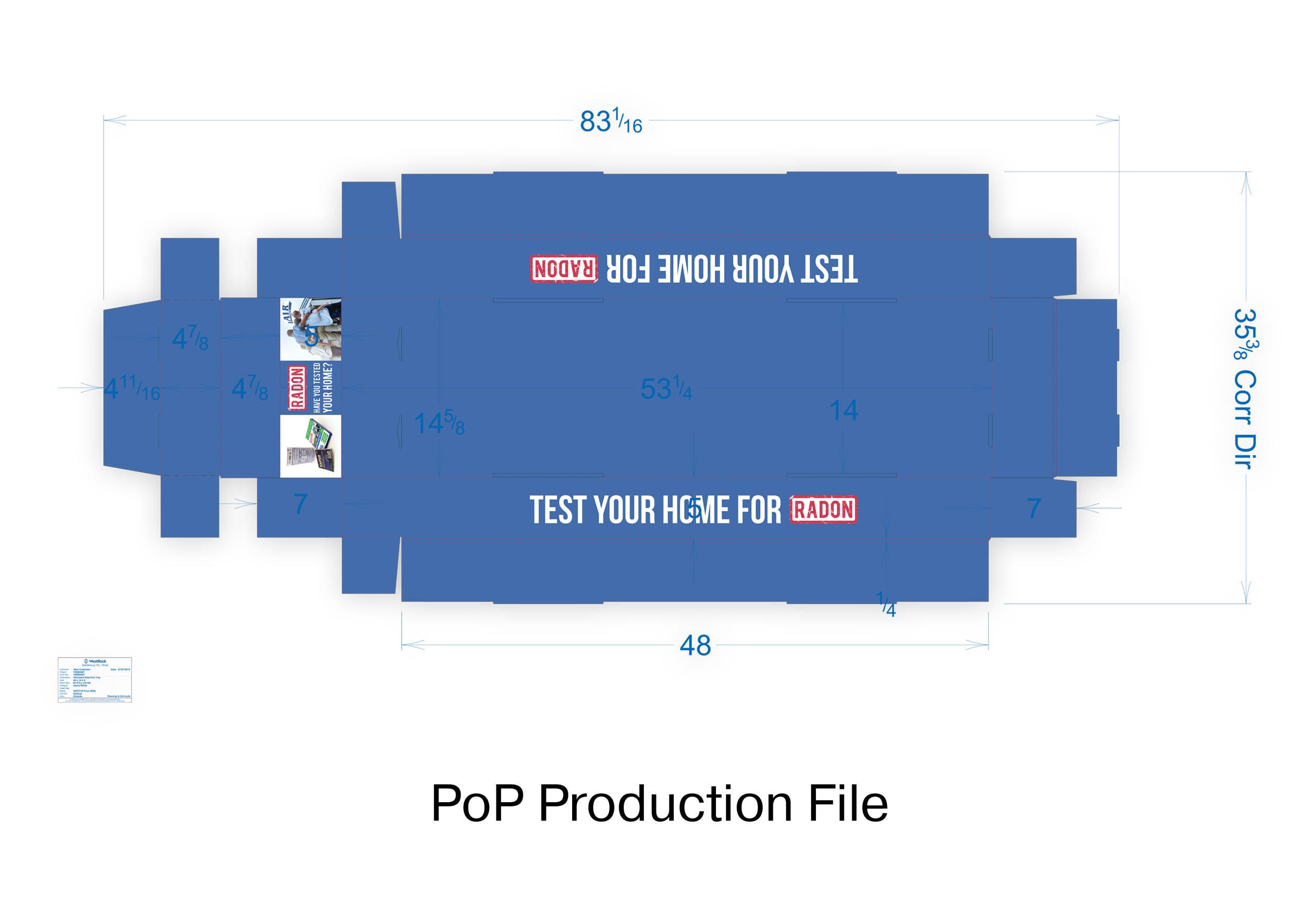
For the Walmart PoP, I was specifically given a sidekick to design from the Walmart design team. The design had to include the product name and a picture of the product. Design areas were the top header and both sides. The executive branch pushed for a fear based headline. Myself and the director of digital marketing, felt that this was a poor tactic and pushed for the simple tagline we had been using. “Have you tested your home?” I presented five different design options to the executive branch and ultimately, the very simple design with the tagline front and center and images flanking it were chosen.
For the CVS PoP and PoS, I presented 3 different options, which were eventually canceled when CVS ordered less product than anticipated.
Finally digital and print advertising followed. The tagline was adjusted slightly due to the pandemic, and most of the look and feel followed the packaging and the sidekick.
The video started as a way to quickly give directions on how to preform the test. Script writing was left up to myself and Matt Hendrix who was the head of training. New Sky Productions carried out the actual filming and production, while the hiring of the VO artist / actress and also the direction and graphics were left up to myself.
Packaging, WalMart PoP Sidekick, CVS digital ads / banners for Google, Facebook and email, and How-To video.
CD: Luke Dobie
Designer: Luke Dobie
Photography: Luke Dobie
Production: WestRock
Video Production: New Sky Productions
Copy: Air Chek Labs and Marketing Department collaboration.
Script: Luke Dobie, Matt Hendrix
Video Direction and visuals: Luke Dobie, Matt Hendrix
Packaging


PoP
Lorem ipsum dolor sit amet, consectetur adipiscing elit, sed do eiusmod tempor incididunt ut labore et dolore magna aliqua. Nunc mattis enim ut tellus elementum sagittis vitae et. Vestibulum rhoncus est pellentesque elit ullamcorper dignissim cras. Et tortor at risus viverra adipiscing at in tellus integer. Integer vitae justo eget magna.